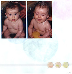
This is a super-simple layout of Ashleigh's bathtime in the kitchen sink. The stickers say sweet, sassy and happy. The background paper shows up much better in person, so it's not quite as plain as it looks here!
Monday, July 18
Subscribe to:
Post Comments (Atom)


4 comments:
Love how this one turned out! And isn't it funny how my layout of the same two pictures is so very different? Gotta love diversity! :)
Great job!
They might be different, but I went back to look at yours again (just LOVE it, those colors really pop!) and realized we put the photos in the same order. LOL.
I love this page!
Sweet Pictures! Love the layout also. I am working on the Less is More thing. I love it and need to do it more often. Great Job!
Post a Comment